Sometimes figuring out how to make a transit trip isn’t an easy task. Figuring out where routes go, when they operate, where to catch the bus, how to pay the fare, when to request a stop and how to orient yourself in an unfamiliar place can be a lot of work, especially for first-time riders. Making that process easy and clear is important to us and we have been working hard to improve our transit information.
New transit service also ushers in a new wave of transit information that is designed to make using VTA easier. You’ll see several information improvements rolling out in the field over the coming weeks and we hope this blog proves helfpul in navigating these changes.
Curious now? You can view New Service schedules and maps at https://www.vta.org/go/routes. You can also use Transit, VTA’s officially endorsed trip planning app, to preview your commute that will go into effect on December 28 at https://newservice.vta.org/plan-your-new-commute-transit.
New Color Code
The New Transit Service Plan uses red, blue and green to categorize routes by frequency.
Red Frequent 15-minute service or better from 6:30am to 6:30pm
Blue Local 20 to 60-minute service
Green Express Peak-period, long-distance service
You’ll see this system on the new bus stop signs, new system map, new time guides and on VTA’s website.
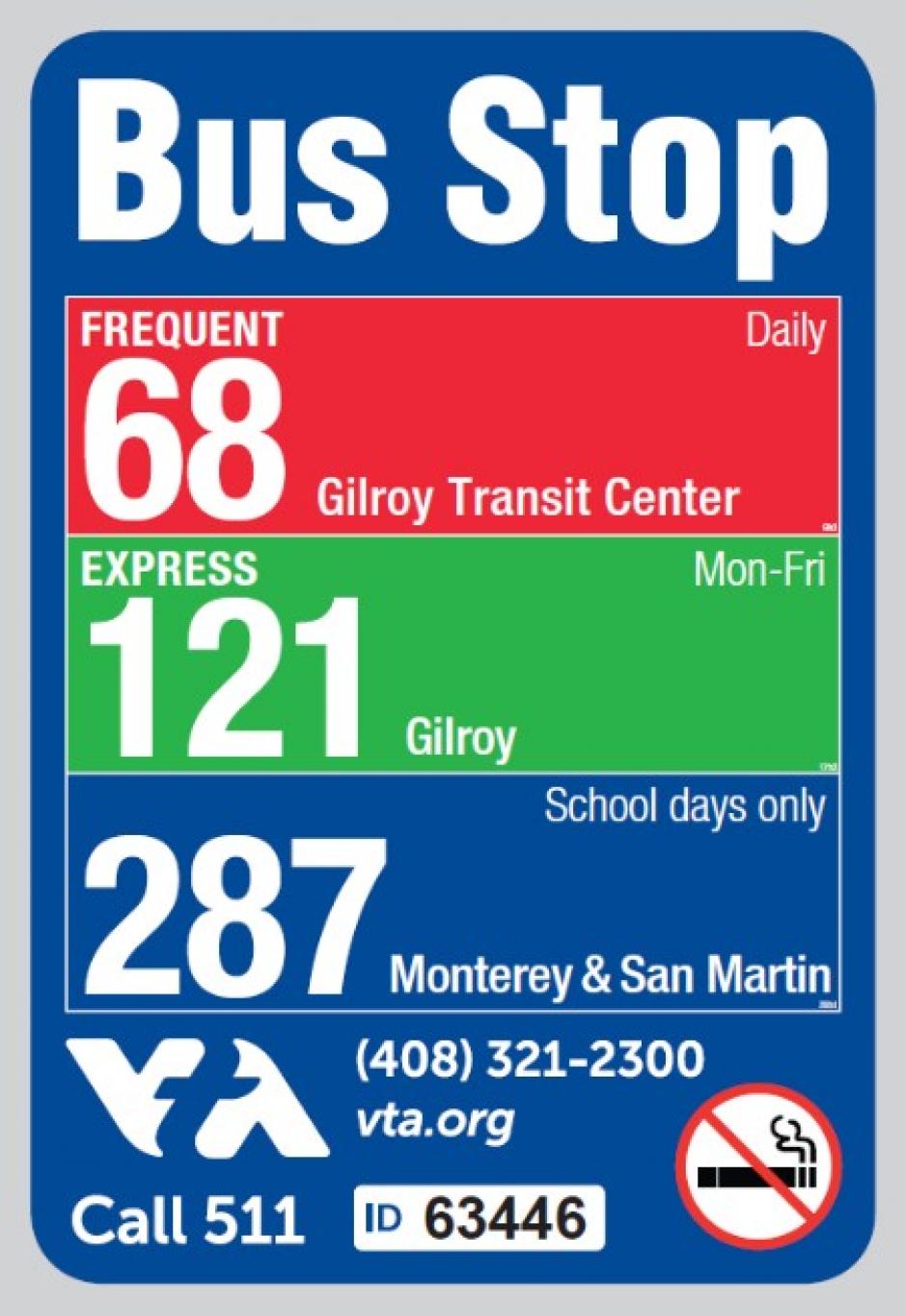
New Bus Stop Signs
We redesigned our bus stop signs to provide more information. In addition to the new color code, we are adding more information about frequency, days of operation and route destinations. The destinations correspond with what you’ll see on bus stop head signs.
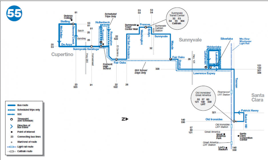
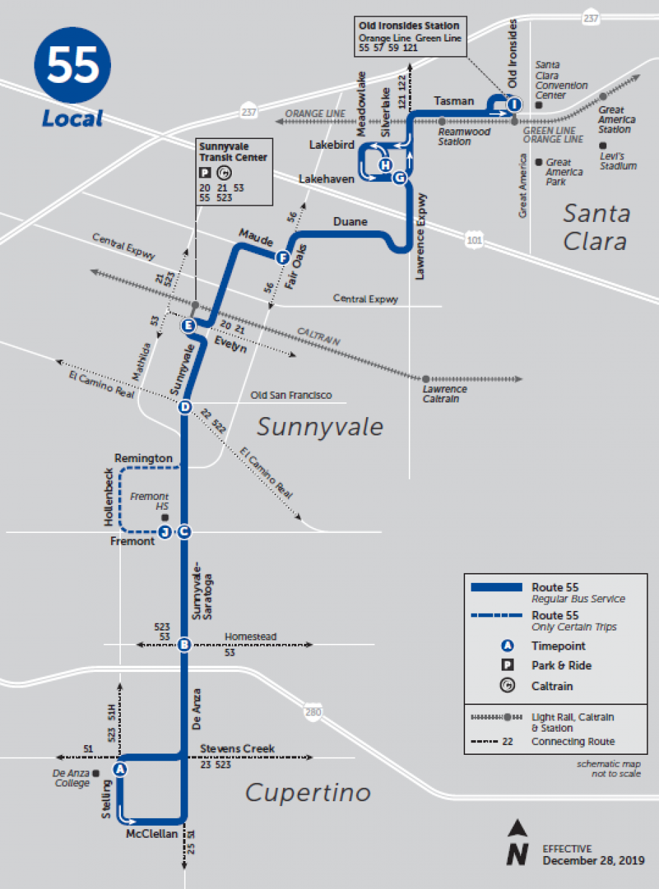
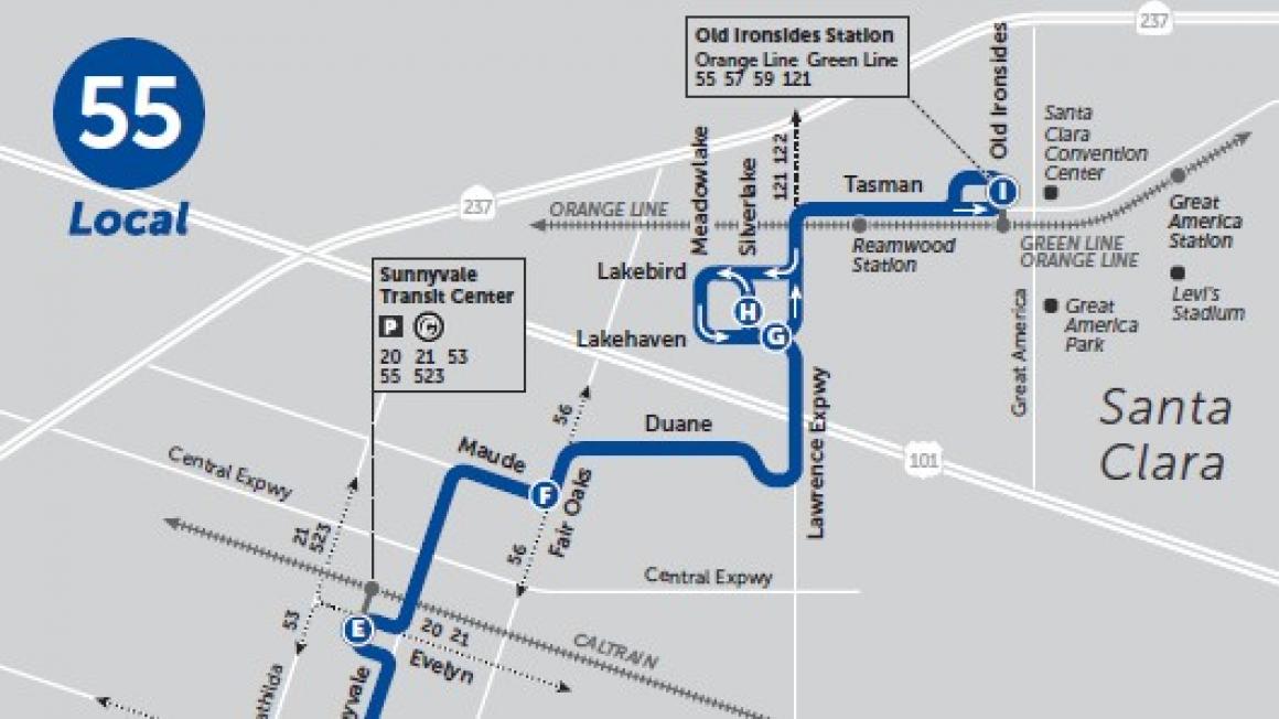
New System Map
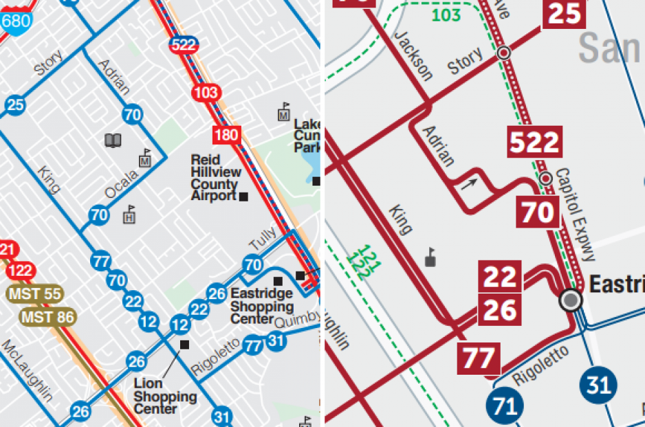
The current system map has some flaws. It’s hard to follow where a route goes when it overlaps with other routes. The express routes, which provide the least service are the boldest visually. Frequency information is lacking. The current map shows every single street in the county, which makes things unnecessarily busy and makes the dense service in Downtown San Jose unclear.
The new map uses line color and thickness to convey frequency and doesn’t overlap lines so it’s easier to follow a route. It is visually very clear where the routes with robust service are. We’ve also removed small streets and rounded some corners to make the new map easier on the eyes and more intuitive.
New Time Guides
The new time guides make some improvements over the current time guides. For starters, the covers are more useful, now providing a simple map of the route and using the red/blue/green color code to denote frequency. The maps on the inside are more legible, match the same shape as the system map, are proportionally to scale and north points up!